
This is Part 2 of our makeover examples. You can also check out more in Part 1.
For HR professionals, summer flies by with meetings, spreadsheets, and preparations… then suddenly it’s October. Now’s the time to think about how you can improve your Open Enrollment communication.
If a picture is worth a thousand words, this second round of before-and-after examples is worth a look. And we promise it’s nowhere near a thousand words.
EXAMPLE #1
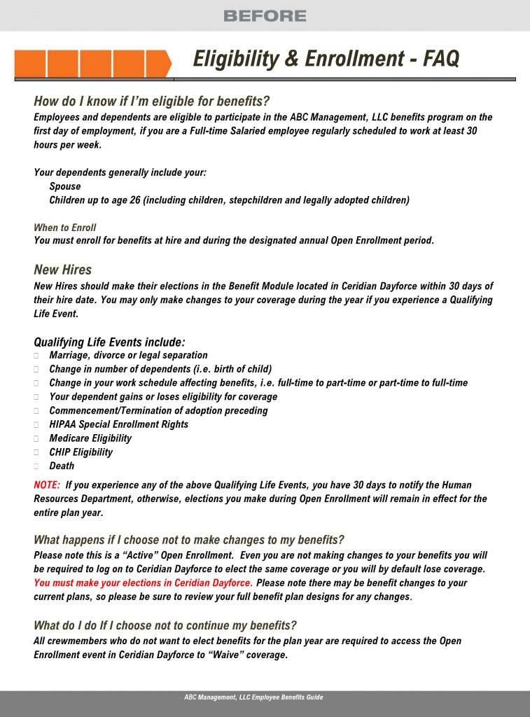
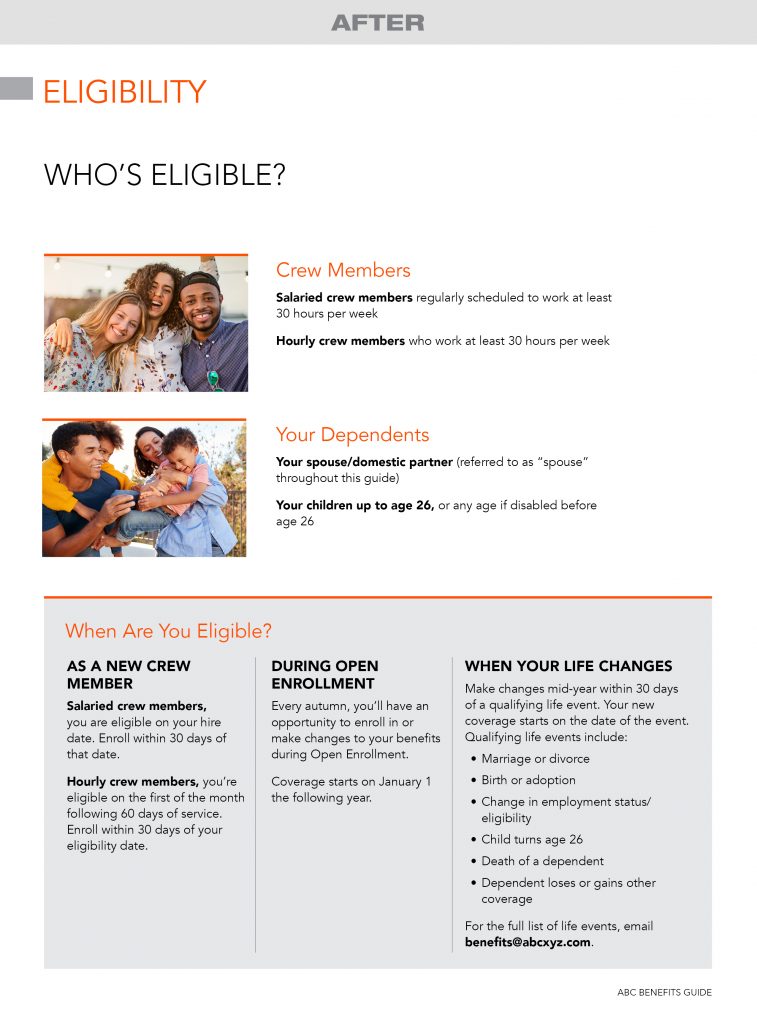
Less (text) is more (understanding). Not only did we reduce this text-heavy benefits guide from 37 pages to 17, we also combined the client’s salaried and hourly guides into one document. What they lost in page volume, they gained in employee understanding. In fact, their benefits department had fewer calls with questions.
EXAMPLE #2
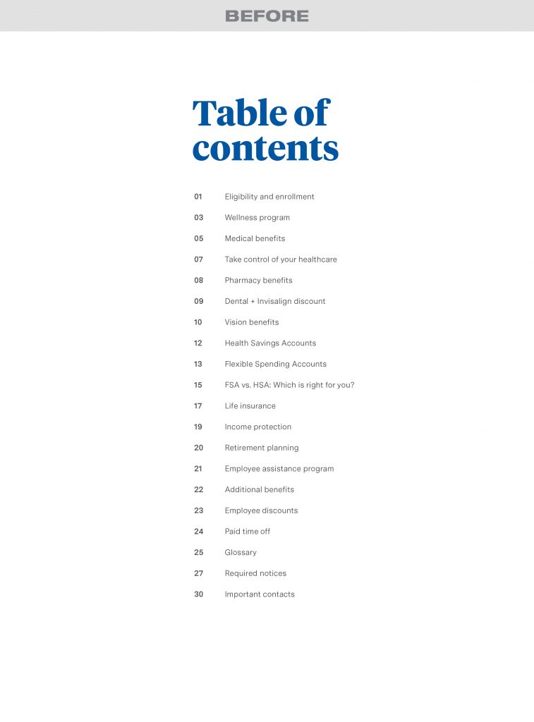
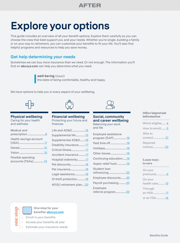
Easier is better. Yes, we simplified and lightened the text load on this client’s benefits guide. But we also made it easier for employees to find what they need — up front we organized benefits into wellness categories: physical, financial, and social/community/career. Then we linked to inner pages.
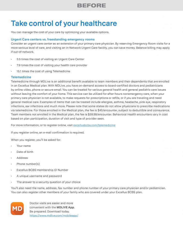
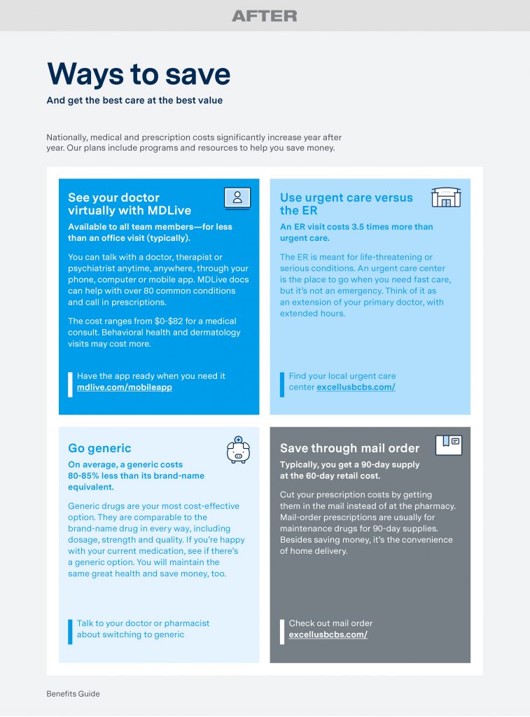
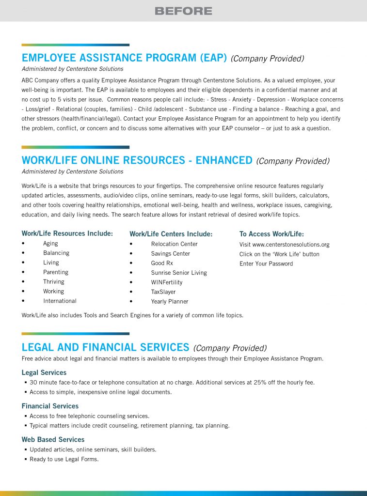
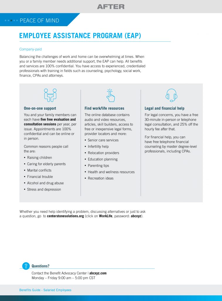
EXAMPLE #3
If they can’t go with the flow, change it. Initially, this client tried to simplify their benefits guide by enlisting the help of a marketing team. But that team didn’t know HR, so the guide lost the employee-focused theme (and didn’t include their 401(k)). We changed the flow to ensure the right benefits were highlighted, and that complicated programs were explained. And yes… we made it easier to read.
Employees are overwhelmed trying to understand health care and benefits. Easy-to-understand communications are the answer (plus, you’ll get less questions).
Check out Part 1 of our before-and-after examples. If you want to see samples of our work, head to this page on our website.


